Designing logos and identities is a unique challenge. In each case, I’ve tried to capture the personality of the client, and translate that into visual form.
I alway have an eye on production as I design. And I’ve carved into my mind the principles I learned as a student: start in black and white, keep it clean and crisp, and make it memorable.
1% Productions is a live music and entertainment business based out of Omaha Nebraska. They produce hundreds of shows each year at The Waiting Room, Reverb Lounge, and many other venues in Nebraska. When I moved to Nebraska in 2003, I was always excited to see the bands they would bring to town. Eventually, I struck up a relationship where I would design posters for the concerts in exchange for admission to the shows. That eventually lead to the development of a new identity for the team. This logo has proven to be pretty durable, as it was introduced in 2005, and is still going strong.
The Blue Dome Arts Festival was an annual tradition in downtown Tulsa, Oklahoma. Each year an identity is developed for the festival, and reflects the iconic blue dome building, which serves as a focal point for the festival activities.
Eagle*Seagull was a phenomenal indie-rock band from Lincoln, Nebraska. Legend has it, the name of the band was inspired by the bizarre sound made by a rogue guitar pedal. This logotype was crafted from a sheet of prehistoric Letraset transfer type.
Hardwork Records was formed in Tulsa, Oklahoma just after the turn of the century. The aesthetic direction was 90s industrial synth-pop.
Paper Garden Records was founded in Nashville, TN back in 2005. This version of the identity stuck around for a good, long while. And they have continued to publish and promote excellent music from around the world.
The Blue Dome Music Series was a weekly event with live music hosted by a local boutique gift shop. The tone for this logo was meant to evoke the record labels on classic LPs.
When it came time to create a logo for my in-law’s local honey enterprise, I knew I had to pay tribute to the family’s beloved dachshund. Thus, the bee-dog was born. They’ve since expanded to a variety of honey-based products and t-shirts. Occasionally, someone who is just a fan of dachshunds makes a purchase based on the logo alone.
Mega Events is the moniker for a wedding/party DJ friend of mine. I liked the idea of “hiding” an M in the cuts on the diamond, which also alludes to all the wedding events he DJs.
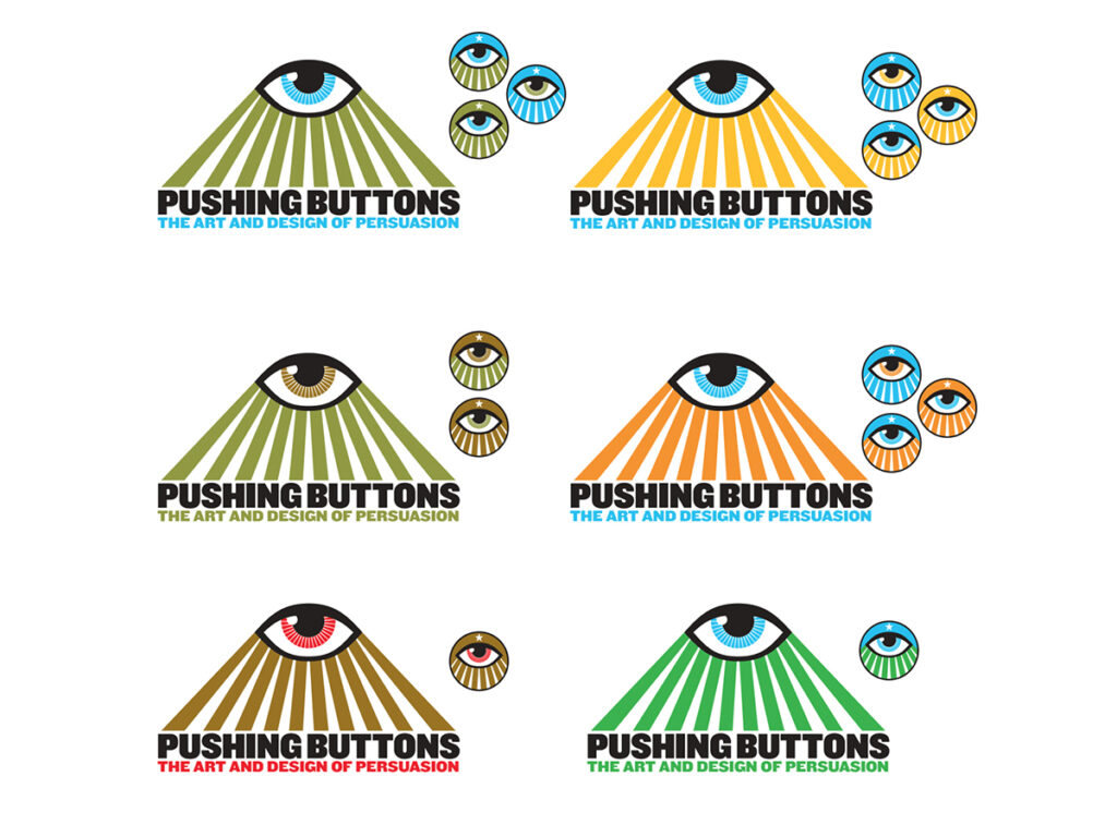
In 2010 I was invited to co-curate an art/design exhibition about the power of propaganda called “Pushing Buttons: The Art and Design of Persuasion.” In my mind, an ominous all-seeing eye fit the bill.
